

The Parts I Remember
By: A.K. Mills
Publisher: Self-Published
Published: March 1, 2013
Genre: New Adult
Act first. Think never. Remember nothing.
Welcome to Kelly Rockport’s existence at Haysville University, where responsibility is just an elective. After all, fake IDs, alter egos, and one-night stands are all part of the college experience, right? So what if she blacks out from time to time? Memory is overrated.
When freshman year lasts about as long as a one-night stand and is quickly followed by the Year of the Blackout, Kelly projects junior year to be nothing shy of amazing. But as shots, beer, cocaine and men mesh together in an intoxicating haze, Kelly’s reckless ways get her into serious trouble. The only problem is, she can’t remember what happened.
As she hovers along the edge of consciousness, Kelly forces herself to think past her pain to piece together the shards of her life. This is her story, told in her words: The Parts I Remember.

The Evolution of a Cover
To be perfectly honest, I have never been one who puts much stock in book covers. Sure they can be pretty, eye-catching, and unique. But what usually persuades me to buy a book is the summary or reviews. I have learned in life that the nicest looking things may not be the best, and conversely that things you may not look twice at may be worth more than you know. So when I decided to publish The Parts I Remember, I didn’t think that much about the cover at first. I had an idea of what I wanted and figured that it would fall into place when I landed my dream agent who would set me up with the biggest publisher and their creative team. Sadly, this was not the case.
When I decided to publish independently, I had one of two options. I could create the cover on my own or I could pay to have it done. After contacting a number of cover designers and obtaining estimates, my husband convinced me that with my background in web design, I had the ability to do it myself and should try. While I wasn’t sure in the beginning, I am thankful now that he encouraged me to believe in myself. It took five design attempts and many hours of thought, second-guessing, and frustration before landing on the image that currently graces the cover of The Parts I Remember.
The first attempt was better in concept than reality. I prefer simple design over busy and wanted to create a pattern that could be followed for future releases. My favorite book covers are those by Emily Giffin. They are all simple, clean, and easily identifiable. So I took an image of a shot glass on a white background, centered it on the page and called it a day. I played around with the fonts for the wording and when I found the one I liked, I placed it around the image and sent it out. The feedback was quick and uniform. Everyone thought it was boring and didn’t come close to encapsulating the emotion and strength of the story.
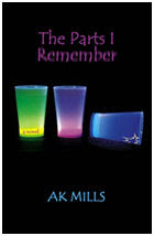 For my second attempt, I searched the web for shot glass images. This time I came across a product image of three florescent shot glasses of different colors on a black background. I contacted the company that sold the shot glasses and after some back and forth correspondence, they gave me permission to use the image. So I sat down at my computer, created a cracked effect on one of the shot glasses and rotated it to give the illusion that it had tipped on its side and was spilling out. I got a little more creative with the font, even blurring the word “Remember” in the title. I loved the neon colors against the black background and thought it was eye-catching. Happily, I sent it out to my reading group. Again, they weren’t feeling it. Enter frustration and self-doubt.
I found another image of a single silver shot glass against a white and black gradient. The cover I created using this image was my favorite. However, it quickly got kyboshed because it was too “Fifty Shades of Grey.”
After taking a brief hiatus to clear my mind, I decided to start fresh and wipe everything out. I did a brand new image search of stock photos. For some reason, I couldn’t get away from the fluorescent colors. However, I continued searching until I found two images that I really liked. I couldn’t decide which I liked more so I decided to create two covers and put them up for a vote.

Option one was almost the one I went with. I loved the colors and the fact that the shot glass was tipped over and spilling out. I kept the blurred part of the title and tried to get fancy with the author placement. This time the feedback was mixed. Those who liked it really liked it and the people who didn’t, really didn’t. When someone told me that it looked amateurish, I decided to go with the other cover. I put everything I had into producing the story. The last thing I wanted was for the cover to take away from it.
At first the final cover was just the image of the liquor pouring over the glasses. But it was missing something. When my husband suggested overlaying a bar scene, I was so exhausted that I told him that it was beyond the scope of my capabilities and that I was going to contact a cover designer. He told me that it wasn’t. So again, I searched stock photos for a bar scene. It pretty much all came together after that. This time, everyone agreed that it looked like an authentic book cover.
 Designing the cover for The Parts I Remember was an extremely valuable learning experience for me. First, I realized that people still do judge books by their covers and that they expect them to make sense. They want the cover to elicit the feelings of the story. More importantly, however, I realized that publishing a book requires much more than writing a good story. I am so thankful for my supportive reading group who put up with the numerous emails and polls about the covers and the placement of the wording until it was complete. And of course if it wasn’t for my husband, who pushed me not to give up, I wouldn’t have endured and created something that I was so proud of.
Which cover do you like the best? Do you judge books by their covers? Drop me a line at byakmills(at)gmail(dot)com and let me know. I’d love to hear from you.
“It’s not what you look at that matters, it’s what you see.” – Henry David Thoreau

Reading has always been a passion of mine. I remember as a child getting lost in Nancy Drew mysteries late at night with a flashlight long after bedtime, unable to sleep until the story was done. Summer vacations didn’t properly start without first visiting the bookstore and selecting a fresh story.
I recently opened a time capsule that was buried in 1999 and my hope for the year 2010 was to have published my first novel. Three years later, that dream is coming to fruition as The Parts I Remember will be published on March 1, 2013.