

I am a cover snob.
There I said it. I’m not ashamed to say that I judge a book by it’s cover. After all, we all judge something within the first few seconds of seeing it. So it stands to reason that with there being millions of books out there, the cover is going to be what draws the eye first. If the cover has managed to snag my interest, then I pick it up and read the synopsis. There have been times where I’ve read a book with a less than fortunate cover. So the cover isn’t the be-all-that-ends-all, but it is going to be what draws people in… or at least what draws me in.
One thing that all covers must have is a connection to the story itself.
I’m not talking about the book being about two people falling in love, therefor you slap two random people on the cover and call it a day. There have been plenty of books where the cover models and the characters description were night and day. Whoever is coming up with these covers should be fired. I know they aren’t always the author’s fault and that publishers have cover designers who do this, but come on. Stop slapping pretty faces on a cover and start actually incorporating your story in the cover itself. I love being able to flip to the cover and look at the characters while reading the book.
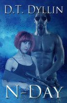
One author who does just this for me is D.T. Dyllin’s M-Day series. There’s no fancy editing done to the picture, no unnecessary photoshopping, or random scenery. Nope, we get the main characters. Sometimes, they aren’t quite pleasant to look at, like N-Day, but when you read the book, you realize that the cover model looks exactly as the character is described. She’s a short girl with a short, frizzy, horribly dyed hair, and the guy… well there were a lot of scenes where he was running around in his fatigues and no shirt. The previous book E-Day has a dude with this hunting hat on. Oookay. However, as I was reading the story, the guy actually starts wearing this hat at one point in the book. I just really like that the author makes sure to incorporate her characters in the cover, or adds tidbits about the cover models into the story. Either way, I’m a huge fan of whatever she’s doing.
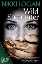
The main character is in Africa releasing a pack of wild dogs back into the wild when her convoy gets intercepted by smugglers and she winds up being held captive. I like that even though there is a face on this cover, it’s not very distinguishable. The hand over the mouth with the African sunset is just awesome. It’s been a few years since I’ve read this one but the moment I look at the cover, I remember what it’s about and how much I enjoyed the story.
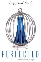
Another cover love of mine is Perfected by Kate Jarvik Birch. No pretty cover models. No teenage girl in a random dress. Nope this cover is very simple with a ballgown in a cage. Which makes complete sense since the book is about a girl who was created to be some rich person’s pet. Not a pet like you read in some of those BDSM books. A pet… like, “Arg Arf”. She is treated like nothing more than dog, she’s not allowed to leave the house, the house is her cage, and they dress her up to show her off to all their other rich friends. So you see, the cover makes complete sense when compared to the story itself.
This is what I look for in a cover.
I look for it to relate to the story. Maybe it’s just me, but I’m sick of all these covers that showcase two people kissing. Come on! Let’s get original. Stop with these covers and start putting out covers that reflect the story within. Unless all the characters in the book do is kiss, then by all means continue. Even if, in Dyllin’s case, your cover has two people on it, make sure those two people look like the characters described in the book. I’m not fooled by two people snogging on the cover. I am not always distracted by pretty things. So if you’re gonna throw home-girl in a dress, make sure she resembles the character described in the book and that it’s the dress she’s actually wearing in the story. Or do what some other covers do, and don’t have cover models at all.
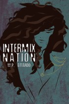
Nazirah is an outcast because she’s what they call and intermix, someone born from different races. This is a dystopian self-discovery story. The cover isn’t overly flashy but it still get the essence of the character. It’s kind of like a painting. You feel the emotions coming through.
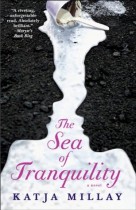
The ice cream is actually presented a lot in the story. Nastya has this addiction to sugar. Her food groups consists of, candy, cookies, cake and ice cream. She once tells Josh that if she goes too long without ice cream she gets really irritable. And since then he either has ice cream in his freezer or he takes her out for ice cream.
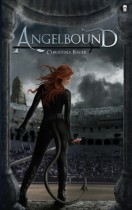
Myla is a quasi-demon who’s purpose it is is to fight evil souls and keep them from gaining entrance into Heaven. On the cover is Myla in her kick-ass demon-hide fighting bodysuit (that she got from the Angels) and the arena as the backdrop. One look at this cover and you know that there is going to be a lot of fighting with things that are not quite human.
What is your stance on covers? Do you look at the cover first before moving on to the synopsis? Does the cover have to match up to the book in some way?


I am a sucker for pretty covers! I think it adds to the story to have that one picture to have in mind. Especially if it’s a really creepy picture. It adds additional feeling to the story as well.
On the more superficial note, I do like books to look pretty on my shelf. Can’t deny that. 🙂
Cucie @ Cucie reads
Oh I agree. There are some books that, if I had the space and extra money for, I’d buy just for the purpose of having their gorgeous cover displayed on my bookshelf.
Oh I’m all about the covers. It’s my determining factor 95% of the time when accepting review requests or buying. I like people on my covers and yeah they totally need to match the characters. I really do not like the non-covers that look like 50 Shades. Instant turn off for me. If they don’t have people that’s fine but I want a scene of some sort. A pretty house. Or some natury thing that relates, etc.
Oh I know. I don’t even bother to read the synopsis of the books that pretty much have no cover. Those ones drive me nuts. There’s nothing that distinguishes them for the other book that has ribbon, pearls, rope, and what have you. I’ll be happy when that trend ends.
The cover is definitely what I notice first. The image should give the feel of what genre the book is too. If I’m in the mood for chick lit, then I’ll be more drawn to lighter colours and fun feeling images. If I feel like a dystopian read, then I’ll be more drawn to darker colours.
I agree. I think because covers are what we first see, it should tell the story of what the book is about in some way.
I am totally a cover snob, and I rely on the cover far more than maybe I should – being a reviewer and all. If I don’t like the cover – I’m not touching the book. I don’t even read the synopsis sometimes, because I don’t like even the little things ruined for me (I know, I’m crazy)
An example would be – I would have never touched the Hunger Games, if someone hadn’t literally forced it on me. The cover did nothing for me, yet it’s perfect to the book.
Great post!
Yeah, when you are looking at hundreds of books a day, the cover is going to be what catches your eye and makes you give that book a few seconds of your time. I will admit that my friend kind of had to cram HG down my through. Not because of the cover but it didn’t sound good at all from the synopsis.